How the bar chart was reinvented to renewed notoriety
By Nir
Bar-Lev, Product ManagerWhen we launched the
Visualization API we wondered,
which new visualization types will the developers out there come up with? Which one will be
successful? Will we quickly see the long tail of visualizations being developed?
Visualizations, as with many other things, follow a rule we know very well at
Google: Their distribution is such that there are a few visualizations at the 'head', which
get the majority of usages, and then there is a long tail of special visualizations, that by
virtue of their subject matter or type, get little overall use.
Take
for example the ubiquitous
line chart
vs the
radar chart:

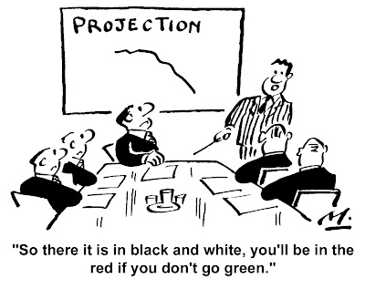
Line charts are extremely useful in
visualizing continuous changes over time or other factors, and as such are used for data sets
ranging from displaying financial results, to the growth of germs on petry-dishes to following
presidential candidates' accumulation of votes. You'll find line charts in almost every type
of presentation, even in cartoons:

On the other hand, radar charts are relatively rare
and most people have never encountered one, unless they happened to have taken an advanced
university course in Marketing, for example.
Obviously there are highly
specialized visualizations that are extremely common. For example, the 2-hands clock view, is
one of the most wide-spread used visualization to display time. Yet, many visualizations have
been developed for specific use in specialized fields of study, or work.
As such, you can imagine we had a fun time betting on which visualization will come out
and which will catch on. Some of the bets in the team were made on us first seeing specialized
visualizations. Perhaps a network diagram. Others, had bet on seeing new, high end, pivoting
and data drill-down, slice-and-dice wizardry. Who won? Apparently we all lost our bets.
It seems the common straightforward visualizations can be reinvented with a
just few simple changes to make them immensely powerful - and fun - as visual tools. Enter,
the Bar (or Column) Chart and the
Piles of
Money visualization:


By altering the standard visual design of the bars (or
columns) as wide lines, or rectangles and simply converting them to an image of a growing pile
of money, the Piles of Money chart has rocketed to the top five most popular visualizations
used over the
Visualization
API. This simple change can provide the same insight as any bar chart, yet when used
on data sets related to cost, revenue or any other financial measurement, it becomes a fun,
engaging chart, not derogating in any way from its original purpose and actually adding
additional emphasis that the subject matter is money.
The
Bars of
Stuff chart was added just after Piles of Money, and provides the same treatment to
the horizontal bar chart as Piles of Money did to the vertical bar chart. Users can choose on
of several cool visual designs, like chocolate, cute worms, etc to be used instead of the
bars.
I can't wait to see someone take the idea behind Piles of Money
and advance it to the next step: create a visualization in which the user can visualize bars
of anything they want by choosing the image to be integrated into the visualization: Piles of
Boxes, Piles of Shoes, Bars of Soap.
To see all of the Visualization
API's current list of visualizations by Google and the community, check out our
gallery.

