
Passkeys are a simple and secure cross-device authentication technology that enables creating online accounts and signing in to them without entering a password. To log in to an account, users are simply shown a prompt to use the screen lock on their device, such as touching the fingerprint sensor.
Google has been working with the FIDO Alliance for years, alongside Apple and Microsoft, to bring passkeys to the world. In 2022 we rolled out platform support for passkeys so that Android and Chrome users can seamlessly sign in to apps and websites across all their devices. In May 2023, we enabled signing in to Google Accounts with passkeys, bringing the security and convenience of passkeys to our users.
Google is in a unique position, as we are both working on the infrastructure for passkeys and are one of the largest services using them. We are rolling out passkeys for Google Accounts carefully and deliberately, so we can measure the results and use that feedback to continue to improve the passkey infrastructure and the Google account experience.
Passwords have been the standard sign-in method since the advent of personalized online experiences. How do we introduce the passwordless experience of passkeys?
Research indicates that when it comes to authentication, users value the convenience the most. They want a smooth and fast transition to the real experience, which only comes after signing in.
Still, the transition to passkeys requires changing muscle memory and users need to be convinced it’s worth making a switch.
The user experience of passkeys for Google.com has been strategically designed to emphasize two principles at every step of the authentication process: ease of use and security.
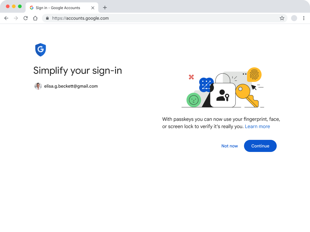
The first passkey screen users see is light and easy-to-digest. The header is focusing on the user benefit, saying “Simplify your sign in.”
The body copy explains “With passkeys you can now use your fingerprint, face or screen lock to verify it’s really you“.
The illustration is intended to ground the message in the value proposition made by the page. The large blue primary action invites the user to proceed. “Not now” is included as a secondary action to allow users to choose whether or not to opt in at this time, leaving the user in control. And “Learn more” is offered for the most curious users who would like to understand passkeys better before proceeding.
We explored many iterations of the pages used to introduce users to passkeys during sign in. This included trying content that emphasized the security, technology, and other aspects of passkeys - yet convenience was really what resonated most. Google’s content strategy, illustration, and interaction design demonstrates this core principle for our implementation of passkeys.
Passkeys are a new term for most users so we are intentionally gently exposing the users to the term to build familiarity. Guided by internal research, we are strategically associating passkeys with security.
The word “passkey” is included throughout the sign-in flow in the less-prominent body copy position. It’s consistently nestled amongst the familiar security experiences that enable passkey use: fingerprint, face scan, or other device screen lock.
Our research has shown that many users associate biometrics with security. While passkeys don’t require biometrics (a passkey can be used with a device PIN, for example), we are leaning into the association of passkeys with biometrics to boost user perception of passkeys’ security benefits.
The additional content behind the “Learn more” has lots of valuable information for users, including reassurance for users that their sensitive, biometric data stays on their personal device and is never stored or shared when creating or using passkeys. We took this approach because most users found the convenience aspect of passkeys appealing, but only a few took into account the biometric element during testing.
Google’s heuristics carefully determine who will see the introductory screen. Some of the factors are whether a user has two-step verification enabled and whether they access that account regularly from the same device.
Users who are most likely to succeed with passkeys are selected first, and over time more users will be introduced (though, anyone can get started at g.co/passkeys today).
Select users are prompted to create a passkey after signing in with a username and password. There are a few reasons we chose this point in the user journey:
Initial user research shows that many users still want passwords as a backup sign-in method. And not all users will have the technology necessary to adopt passkeys.
So while the industry, Google included, is moving towards a “passwordless future”, Google is intentionally positioning passkeys as a simple and secure alternative to passwords. Google’s UI focuses on the benefits of passkeys and avoids language that implies getting rid of passwords.
When users choose to enroll, they’ll see a browser-specific UI modal that enables them to create a passkey.
The passkey itself is shown with the industry-aligned icon and the information used to create it. This includes the display name (a friendly name for your passkey, like your user’s real name) and the username (a unique name on your service–an email address can work great here). When it comes to working with the passkeys icon, the FIDO alliance recommends using the proven passkeys icon–and encourages making it your own with customizations.
Passkeys icon is shown consistently across the user journey to create a familiarity with what the user will see when using or managing the passkey. The passkey icon is never presented without context or supporting material.
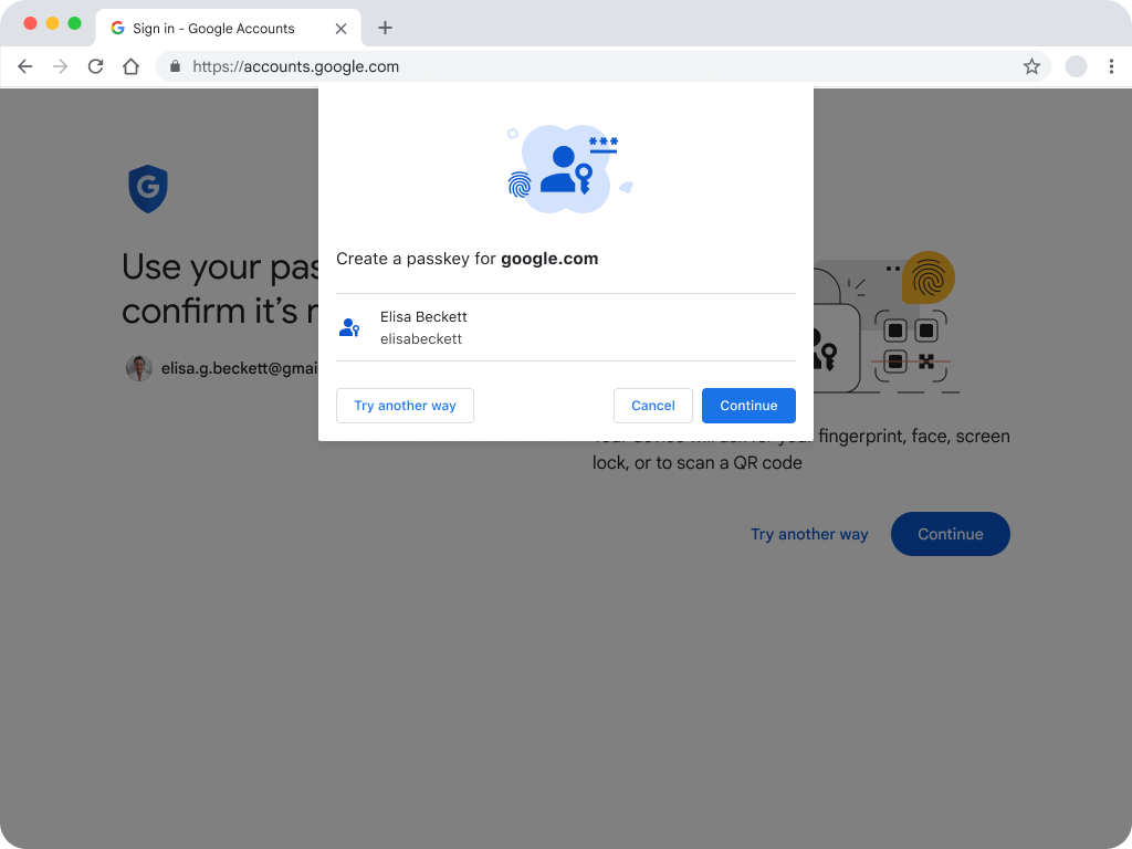
Above, we outlined how the user and the platform work together to create a passkey. When the user clicks “Continue” they’ll be presented with a unique UI depending on the platform.
With that in mind, we learned through internal research that a confirmation screen once the passkey is created can be very helpful in terms of comprehension and closure at this step of the process.
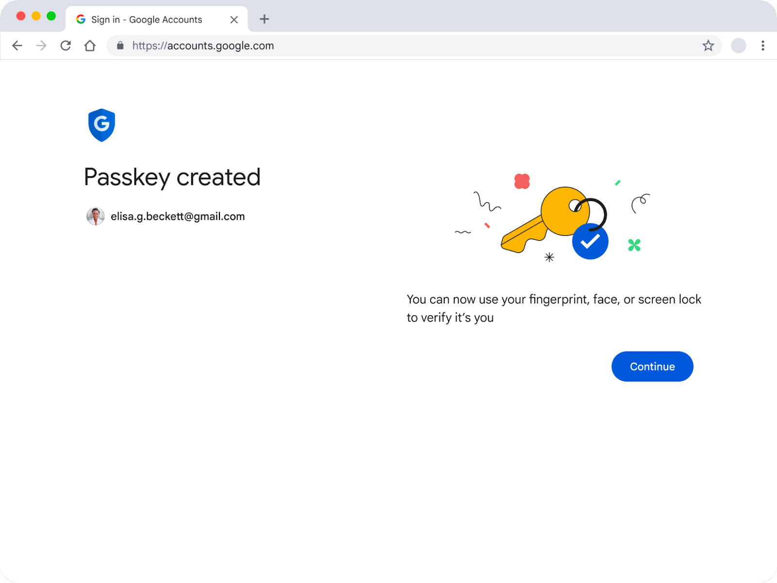
The confirmation screen is a deliberate ‘pause’ to bookend the journey of introducing a user to passkeys and going through the process of creating one of their own. As it is (likely) the first time a user has engaged with passkeys, this page aims to provide clear closure to the journey. We chose a standalone page after trying some other tools like smaller notifications, and even a post-creation email–simply to provide a structured, stable end to end experience.
Once the user clicks “Continue” here, they’re brought to their destination.
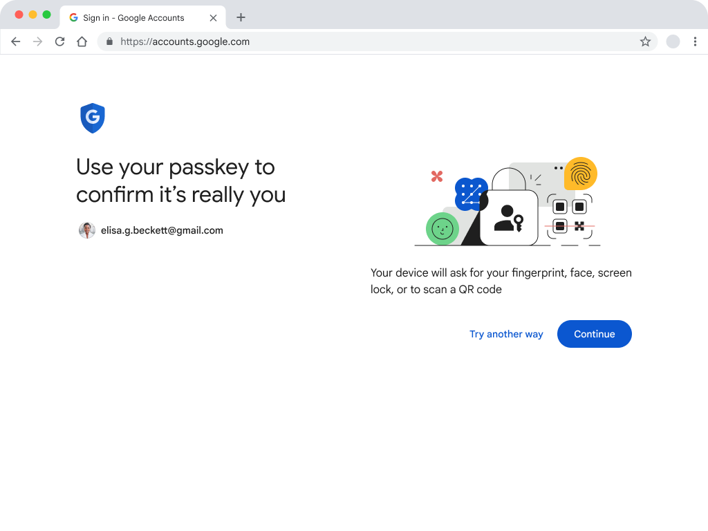
Next time a user tries to sign in, they’ll be greeted with this page. This uses the same layout, illustration, and primary call to action to evoke the first ‘creation’ experience outlined above. Once the user has made a choice to enroll in passkeys, this page should feel familiar and they will recognize what steps they need to take to sign in.
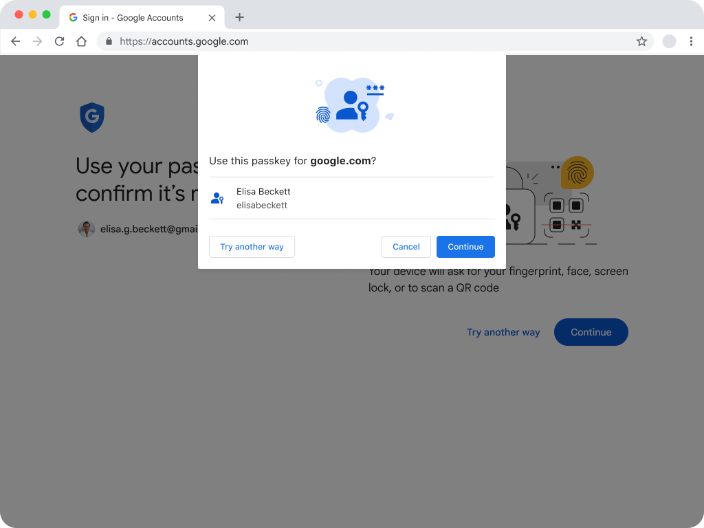
The same principle of familiarity applies here. Intentionally, this uses the same iconography, illustration, layout and text. The text within the WebAuthn UI is kept brief, broad, and re-usable–so everyone can use this both for authentication and reauthentication.
Introducing a whole new page within the Google Account settings pages required careful consideration to ensure a cohesive, intuitive, and consistent user experience.
To achieve this, we analyzed the patterns regarding navigation, content, hierarchy, structure, and established expectations that existed across the Google Account.
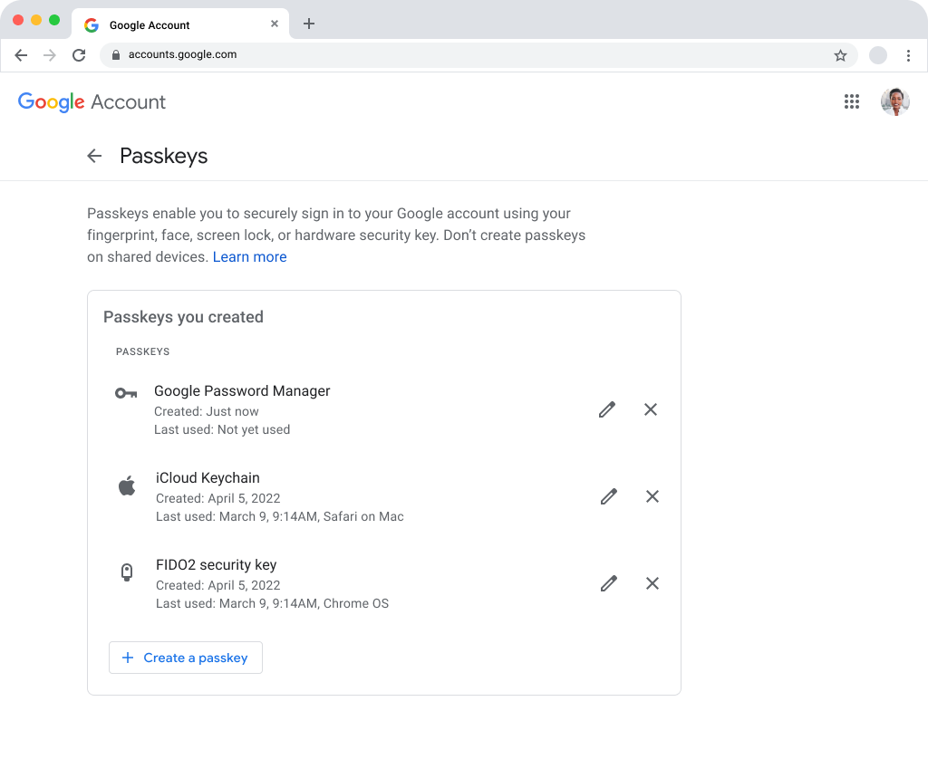
To create a high level category system that would be logical to understand we settled on describing passkeys by ecosystem. This way, a user could recognize where a passkey was created and where it is used. Each identity provider (Google, Apple, and Microsoft) has a name for their ecosystem, so we chose to use those (Google Password Manager, iCloud keychain, and Windows Hello respectively).
To support this, we added additional metadata, such as when it was created, when it was last used, and the specific OS that it was used on. In terms of user management actions, the API only supports renaming, revoking, and creating.
Renaming allows users to assign personally meaningful names to passkeys, which could help particular cohorts of users keep track and understand them more easily.
Revoking a passkey doesn’t delete it from the user's personal credential manager (like Google Password Manager), but renders it unusable until it is set up again. That’s why we chose a cross, instead of a trash or delete icon, to represent the action of revoking a passkey.
When describing the action of adding a passkey to their account, the phrase “Create passkey” resonated better with users compared to “Add a passkey.” This is a subtle language choice to distinguish passkeys from tangible, hardware security keys (though it should be noted that passkeys can be stored on some hardware security keys).
Internal research showed that using passkeys is a relatively seamless and familiar experience. However as with any new technology, there are lingering questions and concerns that will come up for some users.
How the technology works behind the screen lock, what makes it more secure, and the most common “what if” scenarios Google came across in testing are addressed in Google’s passkey Help Center content. Having support content ready with launch of passkeys is critical for an easy transition for users on any site.
Reverting to the old system is as simple as clicking “try another way” when a user is asked to authenticate with a passkey. Additionally, exiting the WebAuthn UI will start users on a path to try their passkey again, or sign into their Google Account in traditional ways.
We are still in the early days of passkeys, so when designing the user experience keep a few principles in mind:
The choices we made for passkeys for Google Accounts were informed by best practices and internal research, and we’ll continue to evolve the user experience as we gain new insights from users in the real world.