Have you built an Action for the Google Assistant and wondered how many people are using it? Or how many of your users are returning users? In this blog post, we will dive into 5 improvements that the Actions on Google Console team has made to give you more insight into how your Action is being used.
We've updated three areas of the Actions Console for readability: Active Users Chart, Date Range Selection, and Filter Options. With these new updates, you can now better customize the data to analyze the usage of your Actions.
The labels at the top of the Active Users chart now read Daily, Weekly and Monthly, instead of the previous 1 Day, 7 Days and 28 Days labels. We also improved the readability of the individual date labels at the bottom of the chart to be more clear. You’ll also notice a quick insight at the bottom of the chart that shows the unique number of users during this time period.
Before: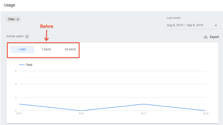 After:

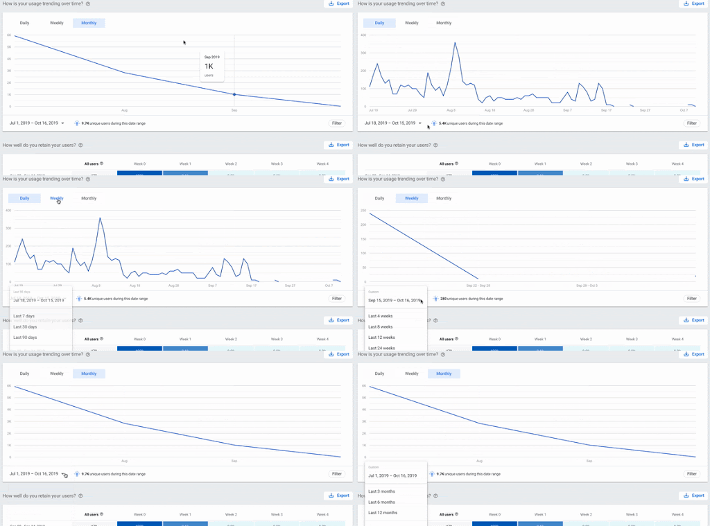
Previously, the date range selectors applied globally to all the charts. These selectors are now local to each chart, allowing you more control over how you view your data.
The date selector provides the following ranges:
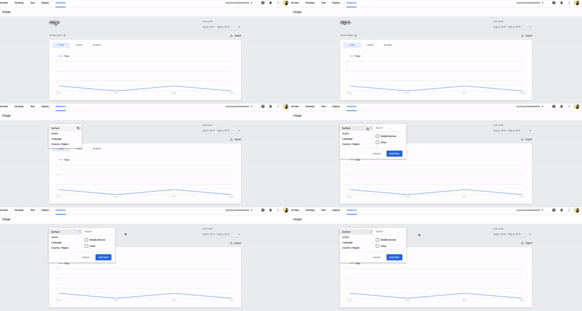
Previously when you added a filter, it was applied to all the charts on the page. Now, the filters apply only to the chart you're viewing. We’ve also enhanced the filtering options available for the ‘Surface’ filter, such as mobile devices, smart speakers, and smart display.
Before:
After:
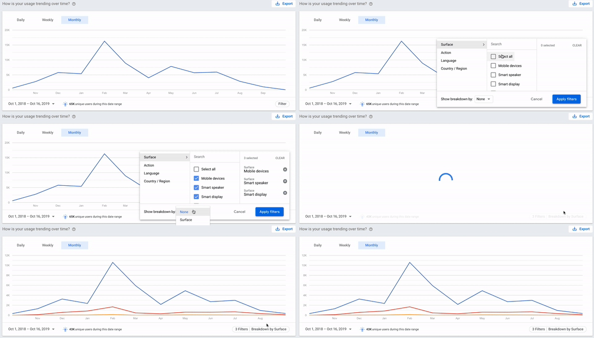
The filter feature also lets you show data breakdowns over different dimensions. By default, the chart shows a single consolidated line, a result of all the filters applied. You can now select the ‘Show breakdown by’ option to see how the components of that data contribute to the totals based on the dimension you selected.
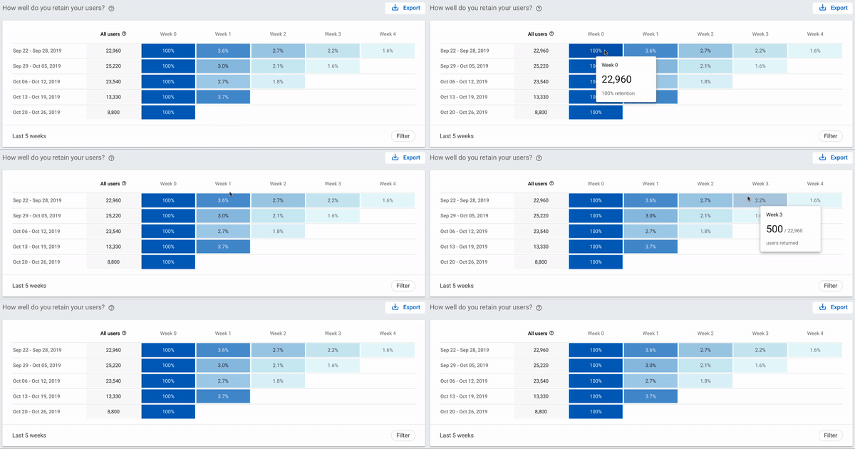
A brand new addition to analytics is the introduction of a retention metrics chart to help you understand how well your action is retaining users. This chart shows you how many users you had in a week and how many returned each week for up to 5 weeks. The higher the percentage week after week, the better your retention.
When you hover over each cell in the chart, you can see the exact number of users who have returned for that week from the previous week.
Before:
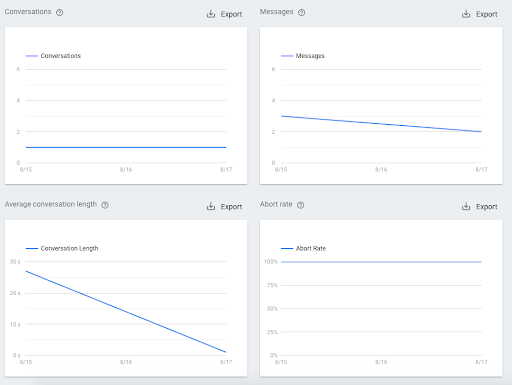
After:
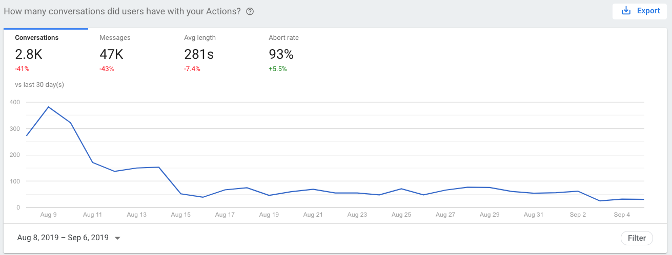
To learn more about what each metric means, you can check out our documentation.
Try out these new improvements to see how your Actions are performing with your users. You can also check out our documentation to learn more. Let us know if you have any feedback or suggestions in terms of metrics that you need to improve your Action. Thanks for reading! To share your thoughts or questions, join us on Reddit at r/GoogleAssistantDev.
Follow @ActionsOnGoogle on Twitter for more of our team's updates, and tweet using #AoGDevs to share what you’re working on. Can’t wait to see what you build!