The Google Pay button is your customer’s entry point to a swift and familiar checkout with Google Pay. Here are some updates we are bringing to the button to make it easier for you to use it and customize it based on your checkout design, while creating a more consistent and informative experience to help your customers fly through your checkout flows more easily.
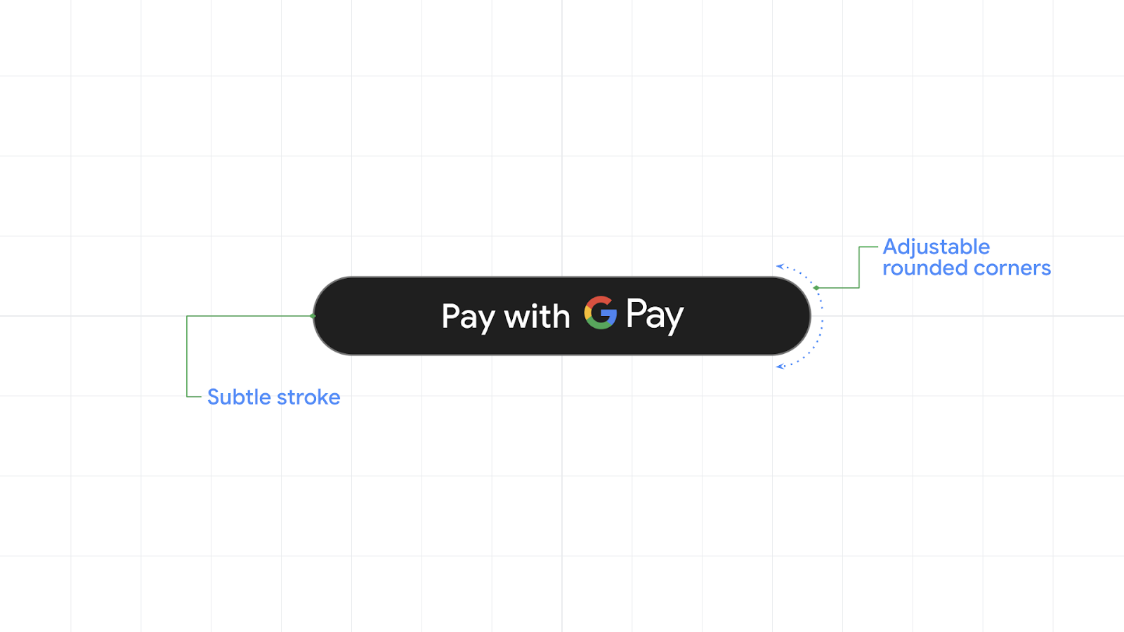
Previously, you told us about the importance of a consistent checkout experience for your business. We gave the Google Pay button a fresh new look, applying the latest Material 3 design principles. The new Google Pay button comes in two versions that make it look great on dark and light themed applications. We have also added a subtle stroke that makes the button stand out in low contrast interfaces. In addition, we are introducing new customization capabilities that make it easy to adjust the button shape and corner roundness and help you create more consistent checkout experiences.

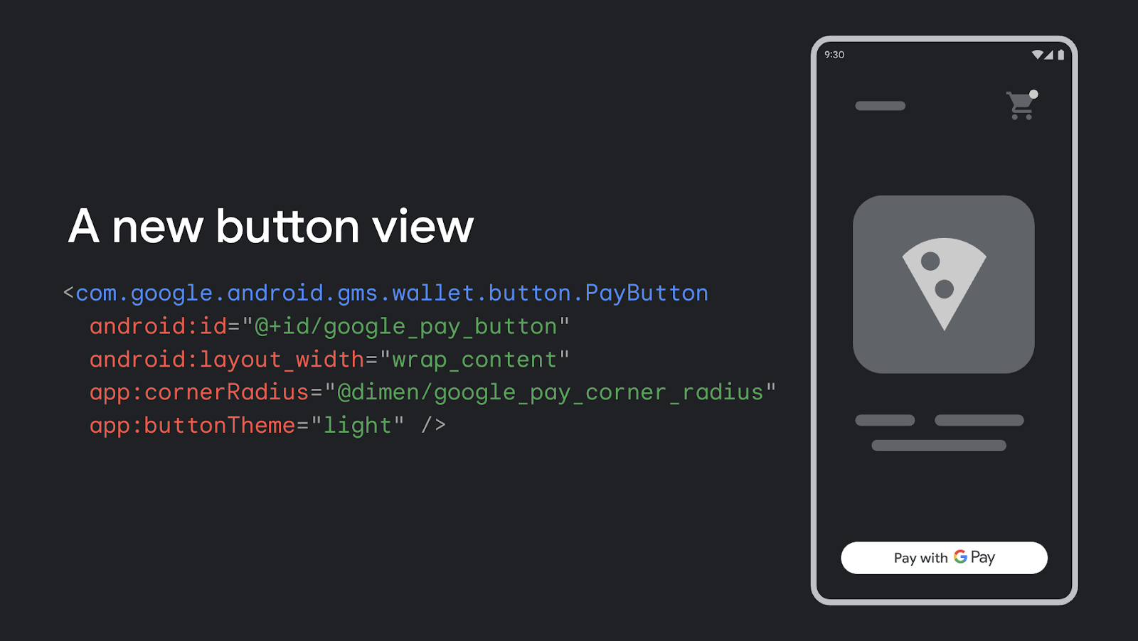
We also improved the Google Pay API for Android, introducing a new button view that simplifies the integration. Now, you can configure the Google Pay button in a more familiar way and add it directly to your XML layout. You can also configure the button programmatically if you prefer. This view lets you configure properties like the button theme and corner radius, and includes graphics and translations so you don't have to download and configure them manually. Simply add the view to your interface, adjust it and that's it.
The new button API is available today in beta. Check out the updated tutorial for Android to start using the new button view.

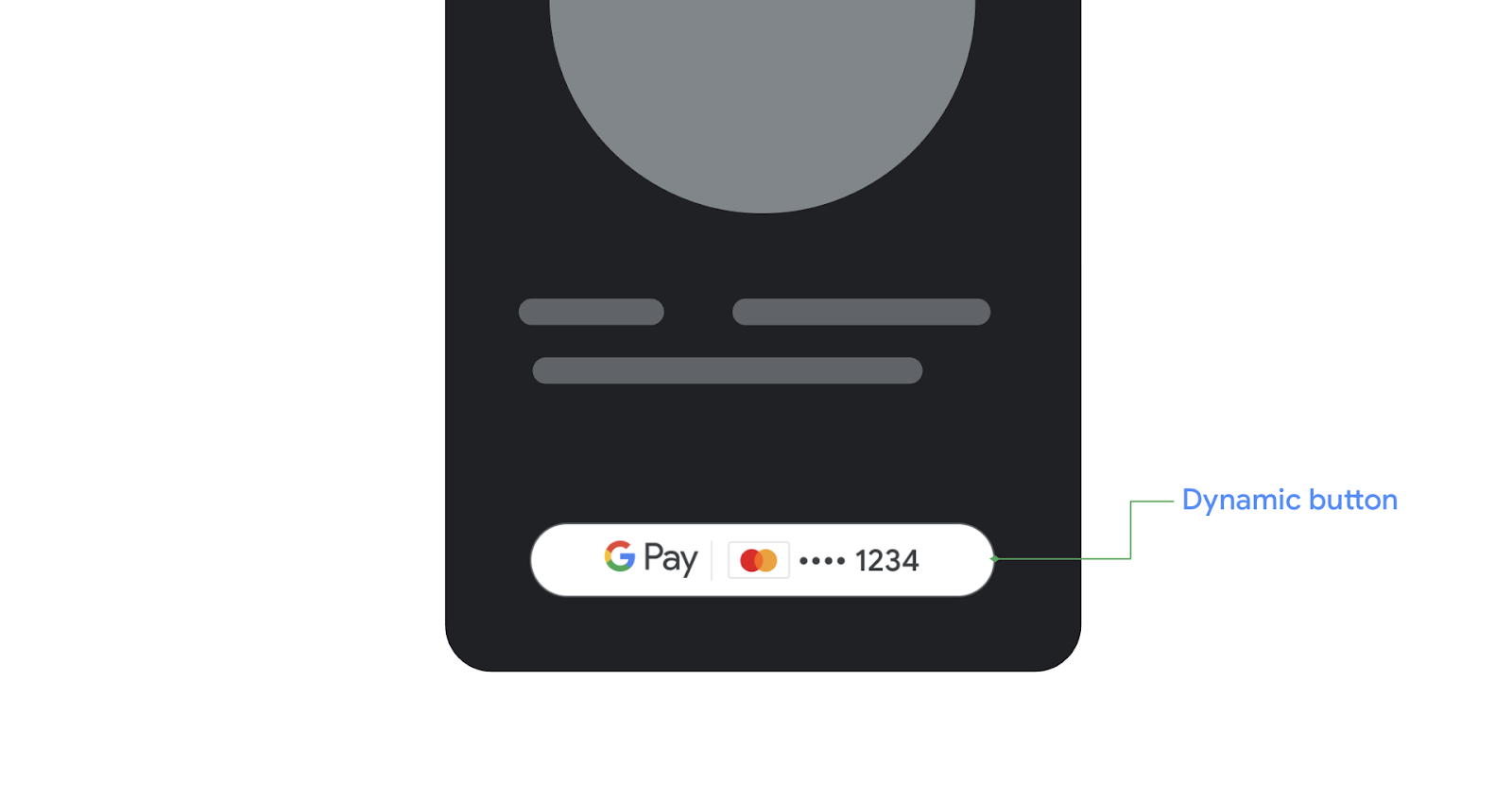
Earlier, we introduced the dynamic Google Pay button for Web, which previewed the card network and last four digits for the customer’s last used form of payment directly on the button. Since then, we have seen great results, with this additional context driving conversion improvements and increases of up to 40% in the number of transactions.
Later this quarter, you’ll be able to configure the new button view for Android to show your users additional information about the last card they used to complete a payment with Google Pay. We are also working to offer the Google Pay button as a UI element in Jetpack Compose, to help you build your UIs more rapidly using intuitive Kotlin APIs.

Check out the documentation to start using the new Google Pay button view on Android. Also, check out our own button integration in the sample open source application in GitHub.